Our New Dining Area
The natural thing to do when you’ve lived in the same apartment for 6 years? Redecorate! Even though we are slowly but surely outgrowing our current home, we love the place to death. And since the apartment search over the past 2 years was not quite a successful as we had hoped (the reason being a mix of our high expectations and not having won the lottery just yet…), I am always trying to create more storage and space.
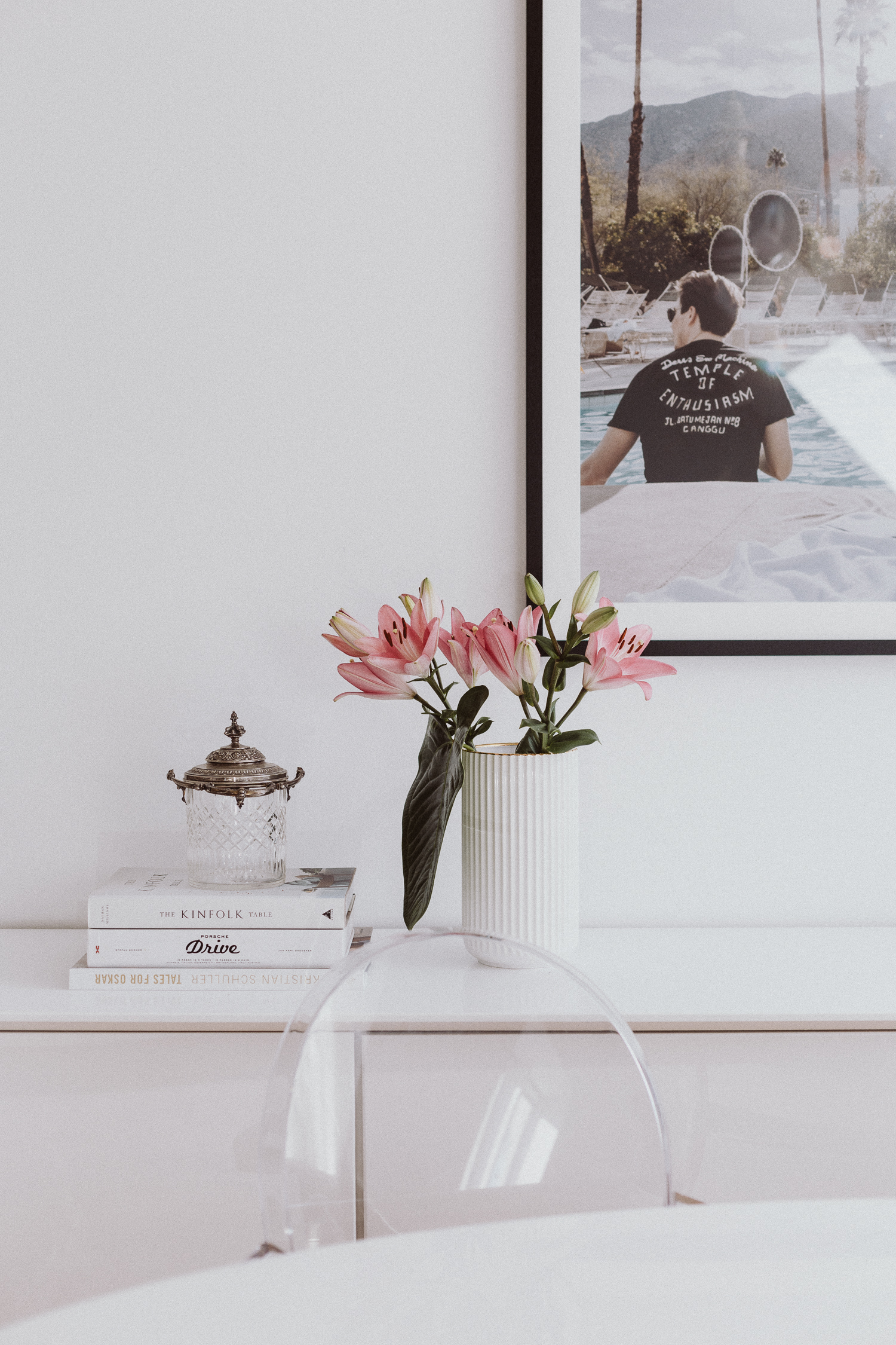
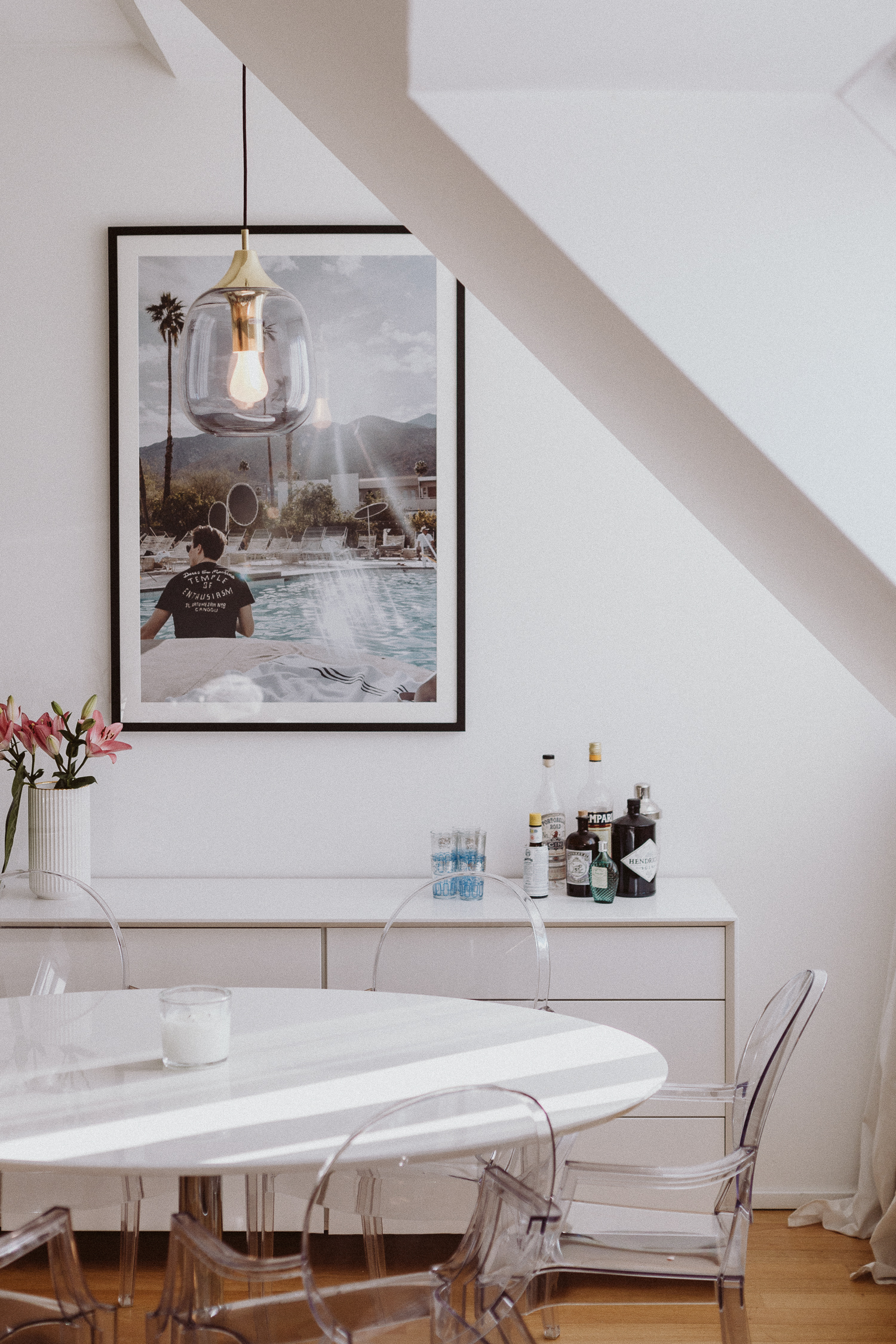
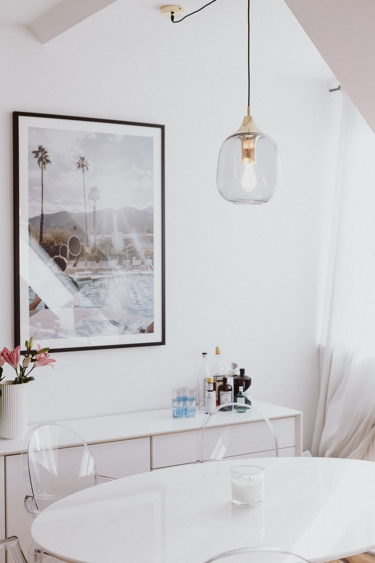
Last year, I added a shelf to the dining area. It did create a bit more storage space but over time I felt like it also made the room feel more cluttered due to the many open shelves. It also made the dining table feel more crammed to me. Hence, it was time for something new. Said and done, I ordered a beautifully sleek new white dining room sideboard, had one of my favorite vacation memories from Palm Springs printed and framed, finally (!) got lamps for the living room and above the dining table and got rid of a few things that had been collecting dust for too long. The result is our new dining area that I absolute love! A little change can go a long way, right?
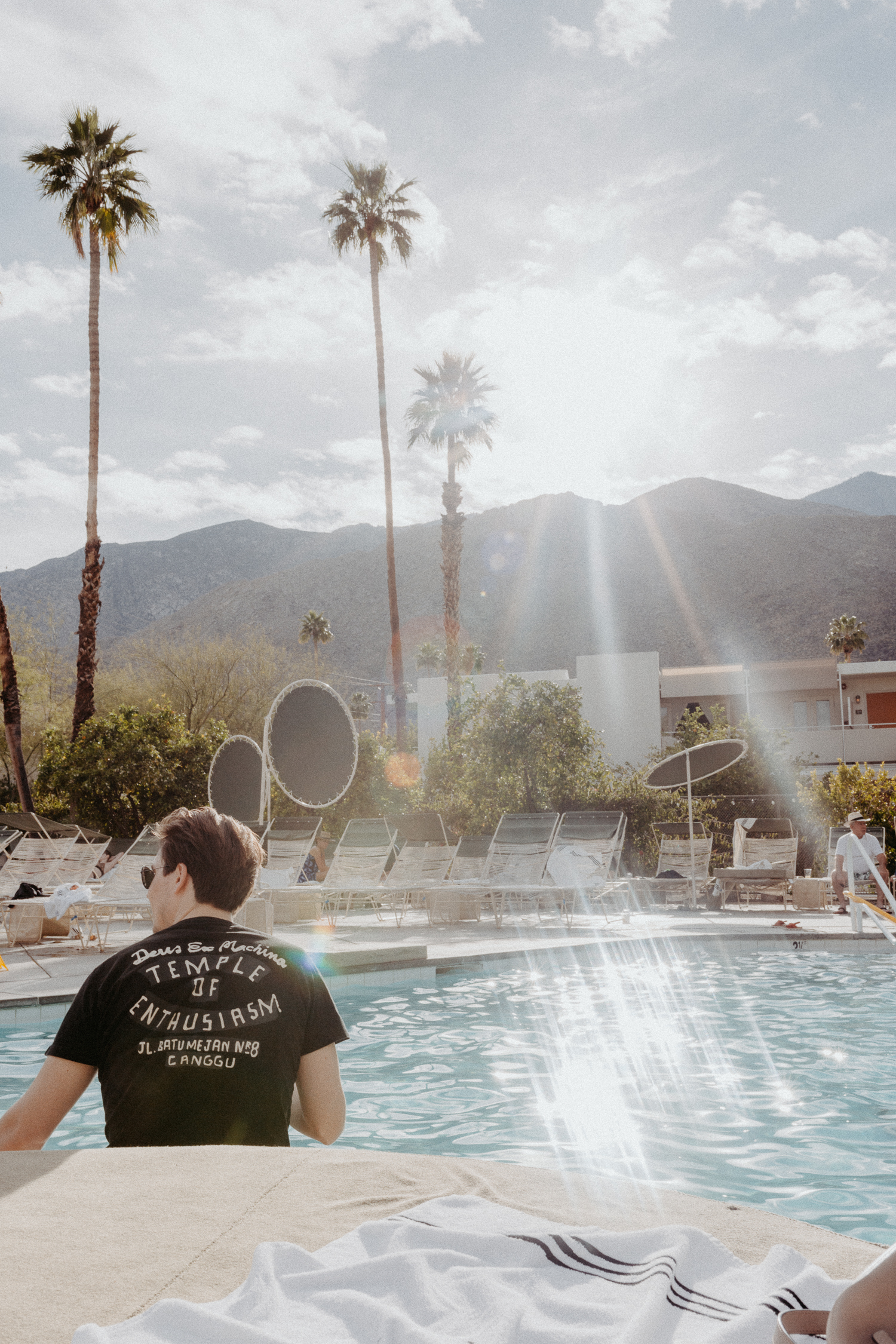
the framed print: (personal) Since we are soon getting a dark green velvet sofa for the living room, I wanted to pick up on those vibes for the dining area as well. I started searching for palm tree prints but couldn’t find anything that I absolutely loved. Then I had the idea of simply using one of my own images. I took this candid shot of Mike during our most recent trip to Palm Springs. I still remember how we were in the perfect vacation mood, the temperature and light were pure bliss and we had just checked-in at the Ace Hotel & Swimclub. The fact that Mike’s face is not really visible makes it impersonal enough to be hanging in our own living room, yet the fact that I took it and he is on it, is so much more personal than anything we could have purchased. For the print and frame, I simply googled and stumbled upon White Wall. I have no reference if it is a good print or not, but I am happy with it and think it turned out great. The price was around 240€ for the print, glass, frame + shipping.
New Dining Area – The Details:
- dining table: (old) We purchased this about 4 or 5 years ago (Interio) and while I still like the white, I think a new dining table will be next on the list. The shiny surface of the table is very easy to scratch and for the future I would prefer a rectangular table. Maybe a bit of wood? Or more white? What do you think?
- dining room sideboard: (new) The new star of our dining area is this sideboard. It is fairly large (220m long) and responsible for creating a much cleaner look. It holds mostly books. It comes delivered in 3 large parts and took me a good 3 hours to put together because I didn’t want to wait for Mike to get home from work. It would have been under 2 hours for sure with a second set of hands.
- chairs: (old) When we moved into the current apartment 6 years ago, the Kartell “louis” ghost chairs were all over Pinterest and at the very top of my interior wishlist. It took a couple of months, but I finally convinced Mike to pitch in for a set of 6 (1 was a gift from my parents). While I still like the fact that they make the room seem larger due to the fact that the chairs are see-through, I have to be honest: they are slighty over-rated. Sure the design is great and they are sturdy. However, they are definitely not the most comfortable chairs and I would probably spend the money differently now…
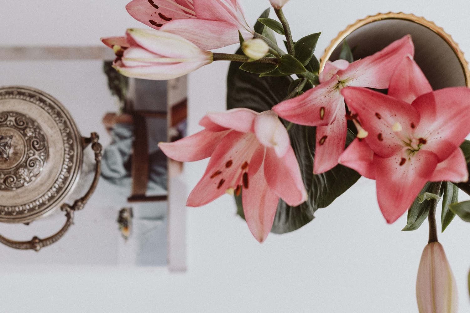
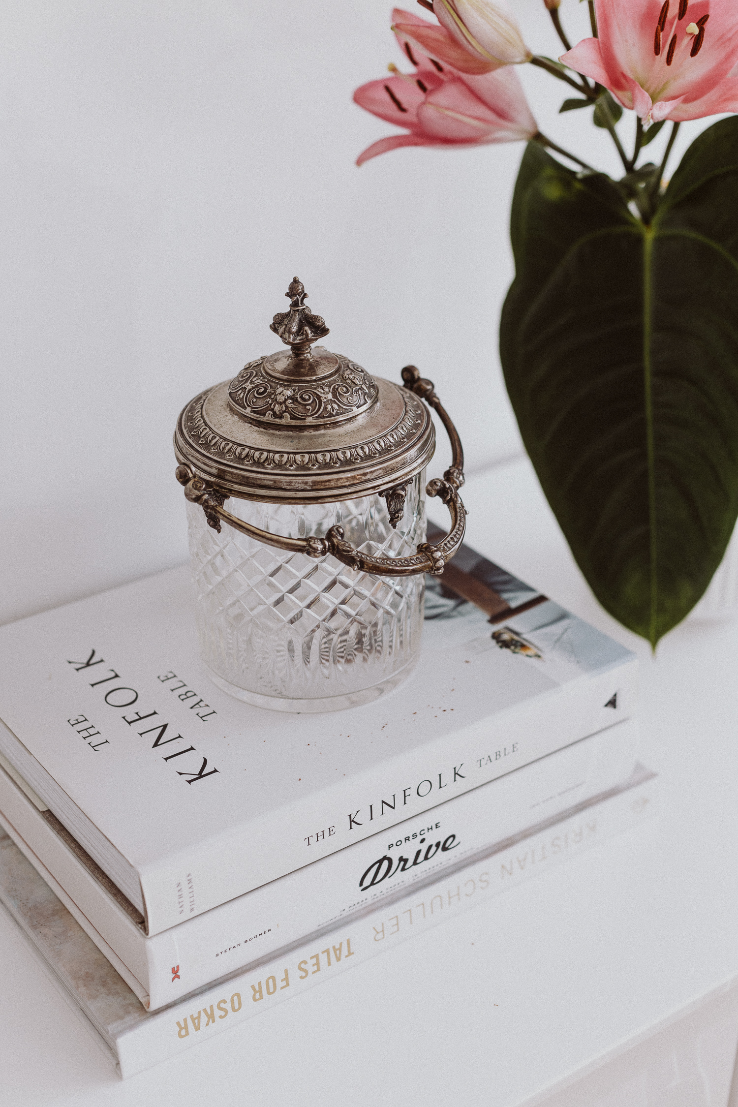
- vases: (vintage + new) The crystal vase with silver lid is very near and dear to me. It was the only thing I wished to inherit from my grandma (aside from a Persian rug, which every grandchild received) when she passed away 2 years ago. With the new set-up I feel like the beautiful piece finally gets the attention it deserves! The white vase next to it is by Lyngby, a Danish porcelain manufactory dating back to 1936 (the factory that is, not the vase). It is my all-time favorite vase for our living room and on constant rotation between the coffee table, dining table and now the sideboard as well.
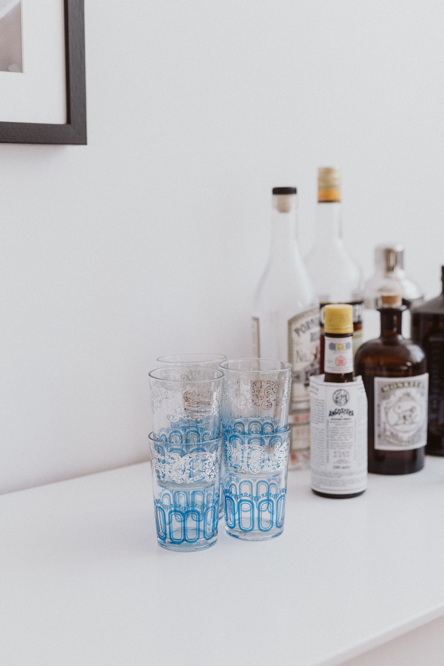
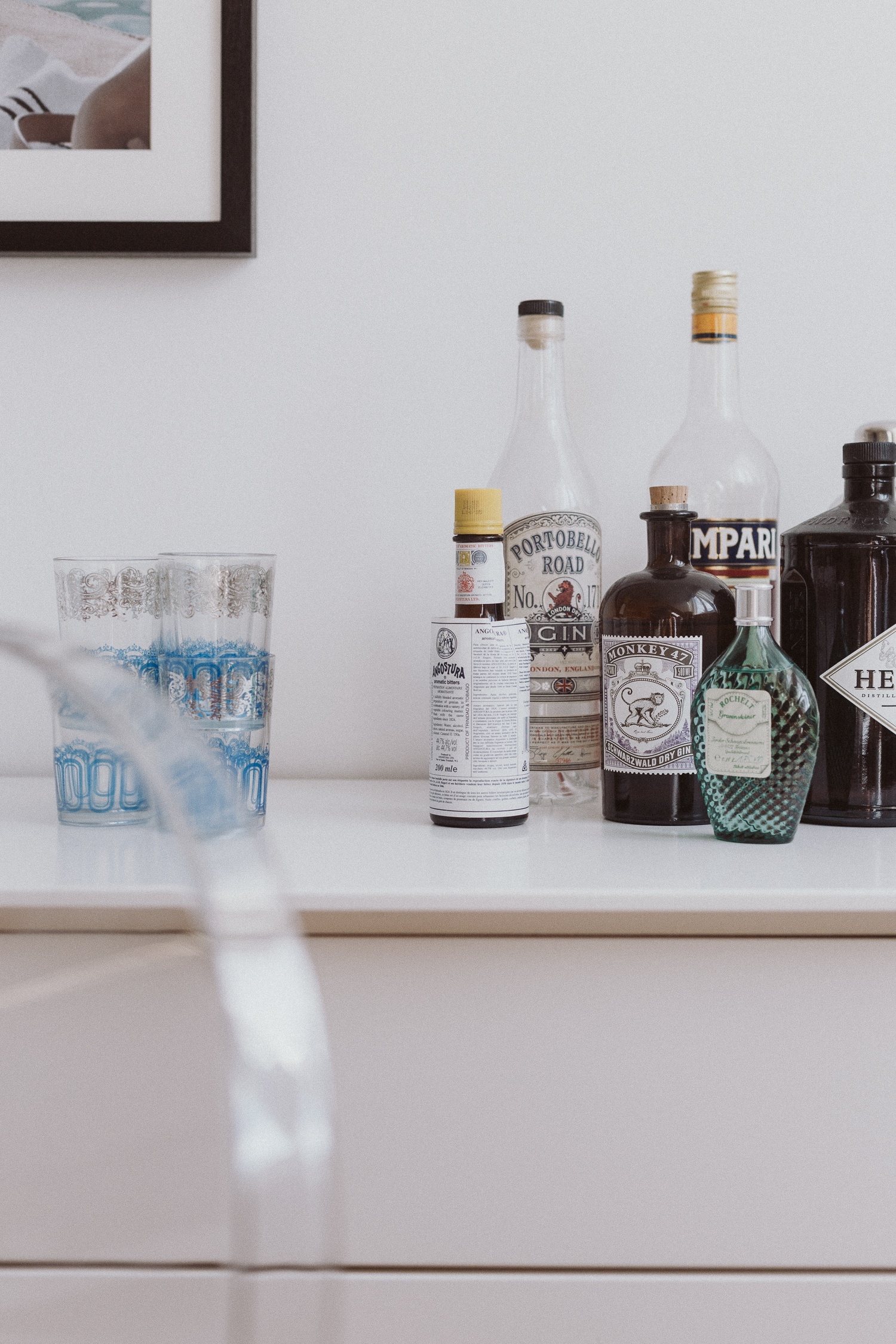
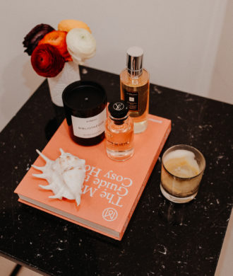
- bar: Eventually, I would prefer to turn the “bar” into a “bar tray”. While the few bottles (can you tell we love gin?!) are fine the way they are right now, I think a tray would be the finishing touch. Just need to find the right one…
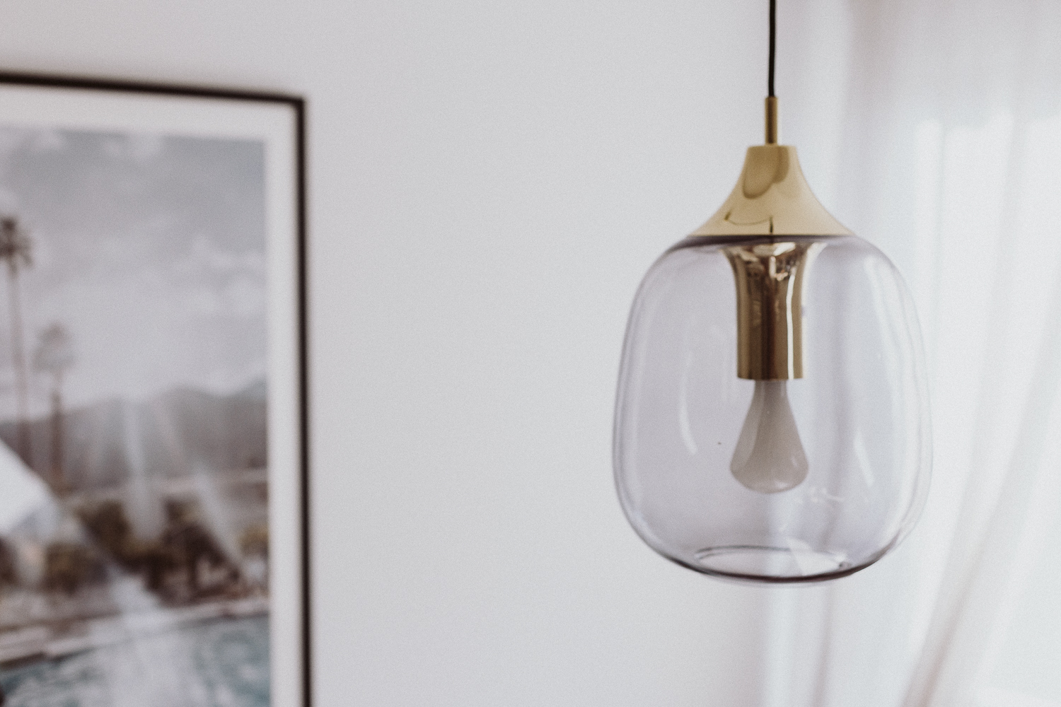
By the way, the glasses are 2€-finds from the souks in Marrakech. - the hanging lamp: (new) We have been serious slackers with putting up lamps in the apartment because most rooms feature built-in spots. Even though the dining table had a lamp above it, 2 other outlets in the living room and kitchen were just bulbs hanging from the ceiling. For six years. I kid you not! But thanks to a recent collaboration with MADE.com, I was gifted 3 of these beautiful mouth-blown lamps and was more or less forced to finally put them up. Obviously, now I wish I had done it 5.5 years sooner, but somehow life got in the way. Finally, the living and dining room is complete! Happy end!













I love how it turned out! We are also currently looking for a house or apartment with garden and it’s been a challenge as well…and we aren’t even in Vienna!
LG, Rosie //The Cheeky Mom
Ugh, that side board is pretty perfect! But 8cm too long for our kitchen 🙁 Got my hopes up too soon!! Love your new additions. And I actually like the all-white look the table provides, but would probably upgrade to a Saarinen marble-top oval table, if I could (a girl can dream, right?).
Die neugestaltung ist super gelungen und gefällt mir außerordentlich gut! Die Idee mit dem eigenen Foto ist auch klasse, ich mache das gerne mit Panorama Shots, die ich je nach Jahreszeit dann wechsele und somit auch ein bißchen neues Feeling bekomme.
Clean und classy!
Liebe Grüße ♥
Claudine / http://www.claudinesroom.com
Liebe Vicky,
du hast so einen super tollen Geschmack! Nicht nur, was Fashion angeht, sondern auch Interior!
Bin ganz verliebt in die Details des Dining Rooms!
Liebe Grüße
Katja
http://www.cestlevi.blog | Follow me on Instagram
Aww danke dir für das liebe Kompliment!! Jetzt bin ich auch endlich so richtig happy mit dem Eck <3
Wow das sieht einfach soo wunderschön aus. Echt tolle Inspiration 🙂
LG
Brini
http://www.brinisfashionbook.com
Looks beautiful!!! But what I like the most! Is that you have amargo de angostura on your bar! How did you discover this little wonder from my country? Have you also try to put some drops on your ice cream?
Kissssesasa
https://lemontrend.com
Hi Sally!
haha I love this comment <3 One of Mike & my favorite drinks of all (!) time is the Rikka Tonic at Zuma. It is a Gin Tonic with a twist. And we asked them how to make it. They add grapefruit and some orange bitters - so we got the Amargo de Angostura and love using it in our drinks. Not on ice cream yet, though! Will definitely have to give it a try!
xox Vicky
In Venezuela we put that little twist in almost all! But with Ice cream ( my favorite vanilla) or on strawberries is amazing!
😘😘😘😘😘
https://Lemontrend.com
Wirklich sehr schön! Ich liebe den frischen Mix an Materialien. Sieht sehr unkonventionell und pfiffig aus! Danke für die Inspo!
Herzliche Grüße
Corinna-Jana
https://looks-like-coja.com/